The Sebastopol painter Mark Perlman—showing through June 15 at Nancy Toomey, SF—was born in Pittsburgh in 1950, and was influenced by the artistic tumult of the 1960s, absorbing the stylistic lessons of both New York (Jasper Johns, Cy Twombly, Franz Kline, Jackson Pollock) and of Europe (Jean Dubuffet, Wassily Kandinsky, and Antoni Tapiès). At one point, he was so taken by Arshile Gorky that his teacher reprimanded him—his art-crush nicely echoing Gorky’s infatuation with Picasso, 40 years earlier: “If he drips, I drip.” The biological theory of recapitulation—i.e.,that ontogeny recapitulates phylogeny, or individual development parallels the development of the species— applies to some artists on an individual scale.
Perlman: “I had to digest the entire history of visual art before I could come up with my own voice…. This was how I found myself.”
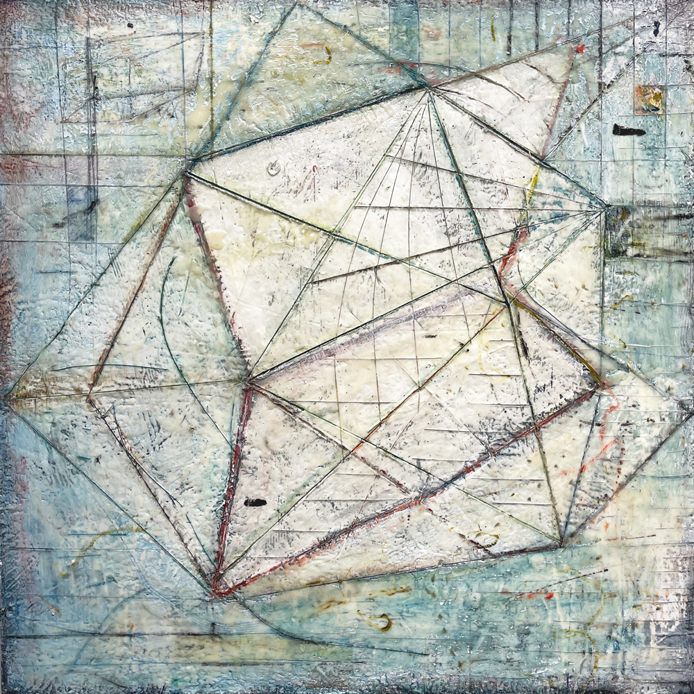
Perlman’s self-discovery evolved in a decades-long creative combat with paint. In the 1980s, Perlman made dark fields of Abstract Expressionist brushstrokes and erasures, dotted with hints of objects, as if representing the conflict between freedom/chaos and order/organization. A decade later, the artist switched from oils to encaustic—beeswax mixed with pigment, his exclusive medium since then—and the earlier ambiguous objects dissolved into contours; the heavily worked surfaces of these paintings suggest heroic fortitude and the depredations of time, and were inspired by the rusting steel mills of the artist’s home town. Around 2000, Perlman adopted a flatter, less turbulent picture space and a lighter palette, and introduced geometric structures suggesting maps, charts, diagrams and game boards that suggest a god’s-eye point of view of terrestrial life.

Art critic Peter Frank:
Wallpaper design, print dresses, graffiti tags sidewalk scuffs, petri-dish cultures, x-rays, wood grains, flagstone fractures, hieroglyphics, maps, phosphenes [light patterns generated within closed eyes], children’s drawings, cloisonné inlays, speech balloons, shadows—anything that can be doodled, collaged or otherwise inscribed…. arranged into elaborate but orderly palimpsests [scraped and repainted vellum manuscripts with hints of the older imagery showing through] that suggest the overlay of civilizations. These paintings are tablets, conjuring ancient wisdom as well as modern research.
That rich melange of objects is not literally depicted, however. Perlman’s sumptuous surfaces are the product of extensive painting and repainting, blurring with solvent, and scraping, with several paintings in progress at any time. The artist: “I like to play with the ideas and then abandon them. As soon as I feel some sense of order or cohesiveness, I stop believing in it. I undermine myself, I do something to help break it or destroy so it doesn’t become too predictable.”

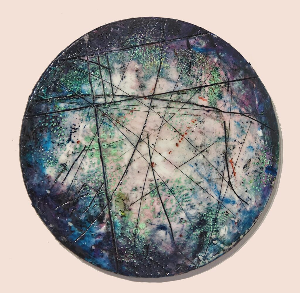
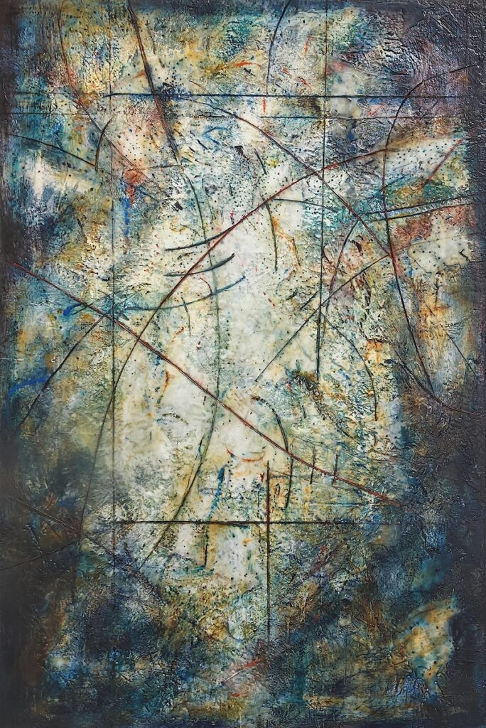
Current show A Study in Contrasts includes seven large encaustics, two smaller works, and eight small paintings in a circular tondo format that further enhance the idea of microcosms. All are in encaustic on panel, and were created during the past two years. They feature richly textured, translucent surfaces that read as engineering diagrams rescued from the elements, as fabric swatches marked for the tailor’s scissors, or even as living topographies inscribed with diagrams—apt tattoo metaphors for the nature-vs.-culture dialogue and dialectic.

Three 48”x48” paintings—“Shine On,” “Lightfest,” and “Fanfare”—and the 60”x48” “Carthage” anchor the show, complemented by “Nightly, “Rigor,” and “Kaia,” all in vertical format, with blurred, darkened, edges, like old vignetted photographs, that suggest the waxing or waning of light. Perlman’s laconic titles (“Parcel,” “Globe,” “Mapping,” “Ghosty,” “Windup,” Gone,” and “Launch”) suggest playful interpretations to his hard-won but infinitely meditative mental landscapes.
MARK PERLMAN: A STUDY IN CONTRASTS through June 15 at Nancy Toomey Fine Art Gallery, SF. More info here.

